When it comes to quoting small group health plans, brokers don’t just need accurate numbers—they need a way to present those numbers clearly.
And that’s where the format of your spreadsheet matters more than you think.
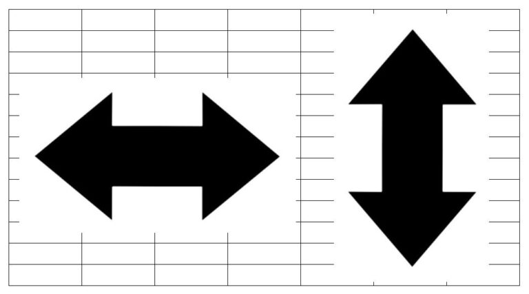
Some brokers swear by horizontal layouts (where each plan is a column). Others prefer vertical formats (where plans run down the page as rows). Each has its pros and cons, and understanding the difference can help you choose the right layout for each client.
Let’s break it down.
Vertical Layouts (Rows): Clean, Concise, One-Pager Friendly
In a vertical format, each plan is listed as a separate row. You can include the plan name, network, deductible, max out-of-pocket, and rates—all in a tidy table that may fit on a single page.
Pros:
-
One-page presentation is often possible, making it easier to email or print.
-
Clients can compare plans quickly by scanning across the row.
-
Great when you’re quoting just a handful of plans or focusing on a specific carrier.
Cons:
-
Limited space for listing benefits—especially if you want to include things like copays, Rx info, or embedded deductible details.
-
Smaller font size may be needed to fit everything, which can be harder to read.
Horizontal Layouts (Columns): More Detail, Easier to Read
In a horizontal format, each plan is a separate column. Benefits run down the page, almost like a traditional benefit summary. This format allows for larger font sizes and more detailed comparisons.
Pros:
-
Larger fonts make it easier for clients to read.
-
Allows you to include more benefit details without sacrificing clarity.
-
Mirrors the format of many Summary of Benefits documents, which can feel familiar to HR reps.
Cons:
-
Takes more space. A full quote may run across two or more pages, especially if you’re showing both employer and employee costs.
-
Harder to print or review quickly—not ideal for one-pagers or side-by-side comparisons during a fast meeting.
So… Which One Is Better?
It depends on your client, your quoting strategy, and how the information will be delivered.
-
Want a clean, digestible summary to kick off a conversation? Go vertical.
-
Need to walk through benefit differences in detail? Go horizontal.
-
Quoting several carriers with multiple plan options? Maybe try both and see which resonates.
The good news is—you don’t have to choose just one.
Stella Lets You Quote Your Way
Stella, BenefitLab’s “Smart Spreadsheet,” gives you multiple output options, so you’re never stuck with a format that doesn’t fit.
Whether you need a quick one-pager for a prospecting call or a more detailed layout for a decision-making meeting, Stella makes it easy to generate both vertical and horizontal views. You can quote with or without a census, run age vs. composite comparisons, and even see which plans most closely resemble the group’s current selections—all in formats that work for you and your clients.
At the end of the day, it’s not about picking one format over another. It’s about having the flexibility to deliver quotes in the clearest, most useful way possible.
With Stella, you’ve got options—and that’s what makes all the difference.
📧 Want to see Stella in action? Email [email protected] to schedule a quick demo.


