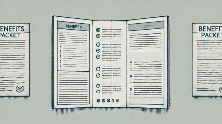
Employee benefits are complicated.
Multiple plan options. Deductibles vs. copays. Networks. Formulary tiers. Pre-authorization. Enrollment windows. Compliance disclosures.
It’s a lot.
And too often, the materials meant to explain these benefits are just as confusing—dense packets, cluttered spreadsheets, inconsistent formatting, and technical jargon that only a seasoned broker can decode.
If your goal is to help employees make better decisions and reduce headaches for HR, then design isn’t just a “nice to have.” It’s a critical piece of the communication puzzle.
Why Design Matters More Than You Think
Clean design isn’t about being trendy. It’s about being clear.
Great design helps people:
-
Understand what their options are
-
See how those options compare
-
Know what to do next
When benefits materials are poorly designed, employees don’t read them—or worse, they misunderstand them. That can lead to bad elections, unnecessary claims issues, or frustration that ends up on HR’s desk.
Common Design Mistakes (and How to Fix Them)
Here are a few of the biggest offenders we see in benefit communication materials:
1. Too Much on One Page
Trying to cram every plan detail into one document might feel efficient, but it overwhelms the reader. Instead, focus on just the highlights employees need to make a decision. Use a clean layout and leave some white space—it helps people focus.
2. Inconsistent Formatting
Different font sizes, alignment issues, varying colors… these may seem minor, but they distract the reader and reduce credibility. A polished layout tells the employee, “This information is trustworthy.”
3. Confusing Cost Displays
Listing premiums without explaining how they’re deducted per pay period or what tier the employee falls into leads to confusion. Use tables that break out the cost per pay frequency and coverage level (employee only, employee + spouse, etc.).
4. Too Much Jargon
Not everyone knows the difference between coinsurance and copayments—or how an embedded deductible works. Use plain language where possible, and define key terms when you can’t avoid them.
What Good Design Looks Like
You don’t need to be a graphic designer to make your benefits materials more effective. You just need to be intentional.
Here are a few principles that go a long way:
-
Hierarchy – Make the most important info stand out. Use headers, bold text, and visual flow to guide the reader.
-
Consistency – Use the same layout across all your materials so employees can find what they need quickly.
-
Simplicity – Less is more. Eliminate unnecessary text, visual clutter, and competing messages.
-
Visuals – A well-placed icon or graphic can draw attention to a key point and break up dense content.
Better Design, Better Outcomes
Clean, client-ready materials:
-
Make HR’s job easier during open enrollment
-
Reduce repeat questions and plan misunderstandings
-
Improve employee satisfaction with their benefits
-
Help brokers win and retain business
That’s why everything we build at BenefitLab—from quoting tools to benefit packets to digital portals—is designed with end-user clarity in mind.
Because if employees can’t understand their benefits, it’s like they don’t have them at all.
📧 Want to see how we make benefits easier to understand and easier to present?
Email Eric at [email protected] to learn more.


